Tropical Design
 |
| Landmark Presentation Board |
The first half, we picked existing buildings in the Metro and applied thereafter the methods and techniques we've learned for natural cooling and ventilation. I chose the Landmark. What I did was just chop it into two so that the winds can enter the building through the courtyard entrance I have provided, much like greenbelt 5. I also made the façade and elevations modern by utilizing glass and also louvres in some strategic areas where the sun is harsh.
T.U. House
 |
| Facade shot of T.U. house |
For finals, our project was to design a house with tropical design features again, applying what we've learned in class. Here's what I came up with.
 |
| T.U. House Presentation Board |
I named it T.U. house because as you will notice in the floor plan, the pool shaped in a letter "T" cuts the floor plan which consequently shapes a "U." I did this to introduce light and natural ventilation inside the house.
Architectural Design 04
In Design 04, we were paired up and our professor gave us interesting projects that really made our creative minds fly and thrive. The projects were to design regional pavilions, a secondary structure, and an international headquarters that will be used in the Manila Expo 2020!
Central Visayas Pavilion
We were assigned a region in the Philippines and we got Central Visayas. Central Visayas is rich in religious history since Cebu, belonging to this region, is where the first mass was held and also where Magellan (Portuguese explorer) gave the first Sto. Nino to the ruling Raja. With that said, we chose the cape of the Sto. Nino as our concept. Also, the reason we chose this concept is because we wanted to connect the two sites as well; Cebu and Pandacan Manila, where the pavilion will be situated. Pandacan has a history also with the Sto. Nino as the first one was found in its rivers.
Our form depicts the folds of the Cape.
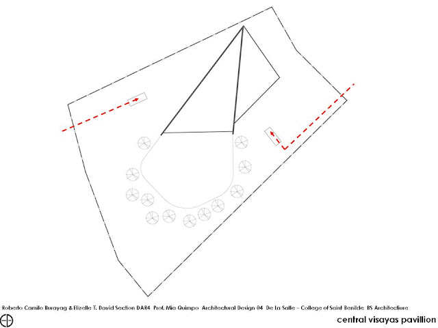
You enter the pavilion from two sunken entrances, one from the main road (right) and one if you're coming from the pasig river (left). We chose underground entrances because we want the visitors to be spiritually prepared as they will see the first ever Sto. Nino in the Pavilion. As you will notice also in the floorplan, everything funnels into a point, that is where the Sto. Nino is placed. Also, you won't see cultural shows in this pavilion. My partner and I strongly agreed that we want this pavilion to be experiential. We think that those pavilions with live cultural shows is so old school that's why we veered away from that setting.
The entrances will direct you in a convergence zone where a water feature is seen
Then eventually, you emerge from the pavilion proper. There's a ramp that vaguely separates the exhibition space from the sanctuary towards the funnelling.
You exit through the all glass façade which gives you a view of an artificial beach we provided. We chose to inject a beach since Cebu is where you can find the most amazing beaches.
 |
| The Central Pavilion as viewed from the main road |
 |
| The underground entrance somberly lit |
 |
| Convergence zone marked by a water feature |
 |
| Pavilion Proper. Wooden boxes serve as pedestals for artifacts from central visayas |
 |
| View of the sanctuary where the fisrt ever Sto. Nino can be seen |
 |
 |
| We provided mounds in the landscaping so people can lounge, sit and appreciate the from of the pavilion |
Ferry Terminal
Our concept for the Ferry terminal for the Expo are the Oil refineries found along the banks of the Pasig river. We chose this because we want to resurrect its image. It has gained an unpleasant connotation because it is one of the main pollutants of the Pasig river. So in having this structure built, it might give "Oil Refineries" along Pasig a pleasant connotation.
 |
| My partner's design |
My partner and I designed our own but the one my professor approved was mine (below)
 |
| My Design of the Ferry Station |
This station is just your casual ferry station. Accommodating about 100 people.
 |
| Ferry Station Presentation Board |
Skype Headquarters
For our final project in Design class, we were tasked to design an office for a brand/ company that is founded in our assigned international region.
Our assigned region is Eastern Europe.
Some of the countries found there
We chose skype as our company. Apparently, upon research, it is a company that has Estonian roots.
Skype's Mission and Vision
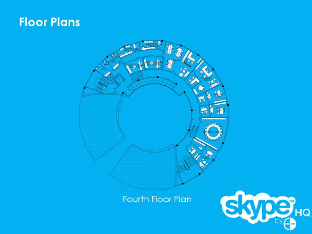
As you can see in the interiors of the headquarters in Luxembourg, Germany, it's very fun and very informal with punches of loud color here and there which also reflects the company's modernity
The headquarters' site will be on the same site where the pavilion is.
 |
| This is supposed to be labelled "Longitudinal Section." Sorry, my bad. |
 |
| View of the headquarters from the main road |
 |
| View from the Pasig river |
 |
| Aerial shot |
 |
| Courtyard |
 |
| Lobby |
 |
| Costumer care |
 |
| General Office Area |
 |
| Cafe |
 |
| President's Office |
As another term closes, another one unfolds *sigh. Hang in there Archi peeps! Let me know what you think. Pls. do comment below!
Peace,
Cholo


No comments:
Post a Comment